This notebook provides a tutorial for plotting Tidy3D components before running them, to get a sense for the geometry.
We also provide a conprehensive list of other tutorials such as how to define boundary conditions, how to defining spatially-varying sources and structures, how to model dispersive materials, and how to create FDTD animations.
import matplotlib.pylab as plt
import numpy as np

import tidy3d as td

# set logging level to ERROR because we'll only create simulations for demonstration, we're not running them.
td.config.logging_level = "ERROR"
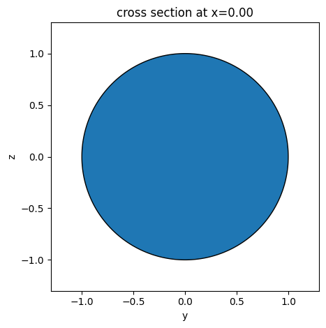
cylinder = td.Cylinder(center=(0, 0, 0), radius=1, length=2, axis=0)
ax = cylinder.plot(x=0)
plt.show()
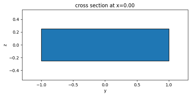
box = td.Structure(
    geometry=td.Box(center=(0.0, 0.0, 0), size=(4, 2.0, 0.5)),
    medium=td.Medium(permittivity=2.0),
)

ax = box.plot(x=0)
We can supply ax argument to the plot function to plot on a specific Matplotlib Axes, for example
# make 3 columns of axes
f, (ax1, ax2, ax3) = plt.subplots(1, 3, tight_layout=True, figsize=(10, 3))

# plot each axis of the plot on each subplot
ax1 = box.plot(x=0, ax=ax1)
ax2 = box.plot(y=0, ax=ax2)
ax3 = box.plot(z=0, ax=ax3)
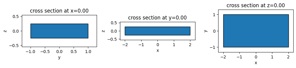
The .plot() method returns either a new axis (if ax not supplied) or the orginal axis, so you can add more objects to the plot, or edit it through the ax handle.
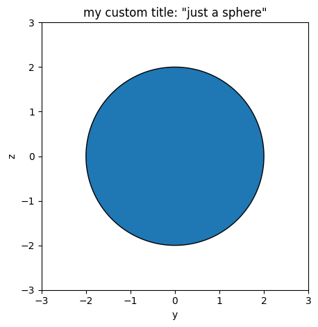
sphere = td.Structure(
    geometry=td.Sphere(center=(0, 0, 0), radius=2), medium=td.Medium(permittivity=3)
)

ax = sphere.plot(x=0)

ax.set_xlim(-3, 3)
ax.set_ylim(-3, 3)
ax.set_title('my custom title: "just a sphere"')
plt.show()
Finally, since the geometry plotting us done using matplotlib Patches, you can supply optional keyword arguments to .plot() to change the display of the plot.
See matplotlib's documentation on Patches for more information on arguments are accepted.
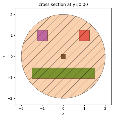
box1 = td.Box(center=(1.0, 0.0, 1), size=(0.5, 0.5, 0.5))
box2 = td.Box(center=(-1.0, 0.0, 1), size=(0.5, 0.5, 0.5))
box3 = td.Box(center=(0, 0.0, 0.0), size=(0.2, 0.2, 0.2))
box4 = td.Box(center=(0.0, 0.0, -0.8), size=(3, 0.5, 0.5))

ax = box1.plot(y=0, facecolor="crimson", edgecolor="black", alpha=1)
ax = box2.plot(y=0, ax=ax, facecolor="blueviolet", edgecolor="black", alpha=1)
ax = box3.plot(y=0, ax=ax, facecolor="black", edgecolor="black", alpha=1)
ax = box4.plot(y=0, ax=ax, facecolor="green", edgecolor="black", alpha=1)
ax = sphere.plot(
    y=0, ax=ax, facecolor="sandybrown", edgecolor="black", alpha=0.5, hatch="/"
)
Simulations
We can plot all components contained in Simulation with the Simulation.plot() method.
Let's create a simulation with a source, monitor, and a bunch of randomly placed spheres made of 3 distinct Medium objects.
from numpy.random import random

L = 5  # length of simulation on all sides


def rand():
    return L * (random() - 0.5)


# make random list of structures
structures = [
    td.Structure(
        geometry=td.Sphere(center=(rand(), rand(), rand()), radius=1),
        medium=td.Medium(permittivity=np.random.choice([2.0, 2.5, 3.0, 3.5, 4.0])),
    )
    for i in range(20)
]

source = td.UniformCurrentSource(
    center=(0, 0, -L / 3),
    size=(L, L / 2, 0),
    polarization="Ex",
    source_time=td.GaussianPulse(
        freq0=100e14,
        fwidth=10e14,
    ),
)

monitor = td.FieldMonitor(
    center=(-L / 4, 0, 0), size=(L / 2, L, 0), freqs=[100e14], name="fields"
)

# make simulation from structures
sim = td.Simulation(
    size=(L, L, L),
    grid_spec=td.GridSpec.auto(wavelength=4),
    boundary_spec=td.BoundarySpec(
        x=td.Boundary.pml(num_layers=10),
        y=td.Boundary.periodic(),
        z=td.Boundary.pml(num_layers=10),
    ),
    structures=structures,
    sources=[source],
    monitors=[monitor],
    run_time=1e-12,
)
f, (ax1, ax2) = plt.subplots(1, 2, figsize=(10, 10))
ax1 = sim.plot(x=0, ax=ax1)

# put the grid lines on the 2nd one
ax2 = sim.plot(x=0, ax=ax2)
ax2 = sim.plot_grid(x=0, ax=ax2)
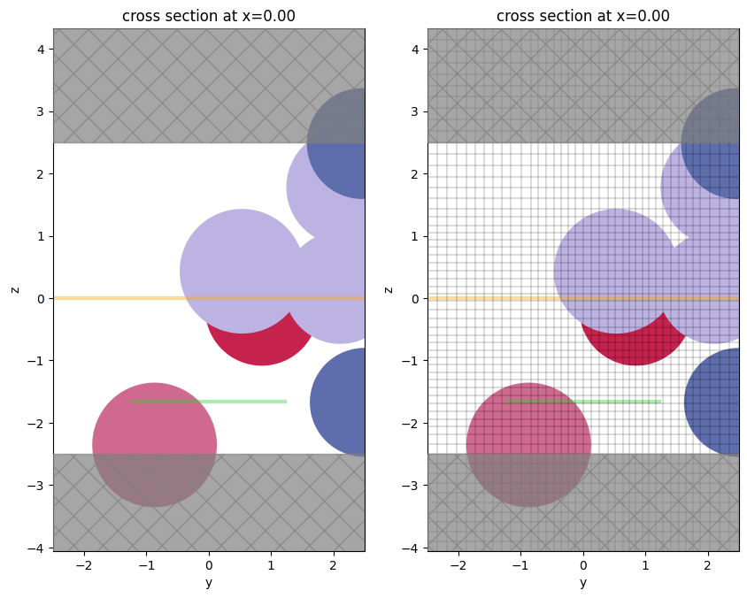
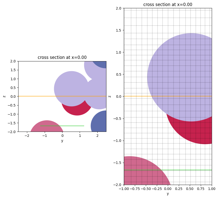
As of 2.4, Simulation.plot() and Simulation.plot_eps() have bounding plot options. One can implement a horizontal range of plotting (hlim) and/or a vertical range of plotting (vlim):
f, (ax1, ax2) = plt.subplots(1, 2, figsize=(10, 10))
ax1 = sim.plot(x=0, ax=ax1, vlim=[-2,2])

# put the grid lines on the 2nd one
ax2 = sim.plot(x=0, ax=ax2, hlim=[-1,1], vlim=[-2,2])
ax2 = sim.plot_grid(x=0, ax=ax2, hlim=[-1,1], vlim=[-2,2])
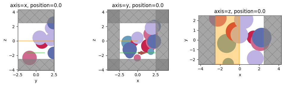
f, axes = plt.subplots(1, 3, tight_layout=True, figsize=(10, 3))
for ax, axis in zip(axes, "xyz"):

    ax = sim.plot(**{axis: 0}, ax=ax)
    ax.set_title(f"axis={axis}, position=0.0")
plt.show()
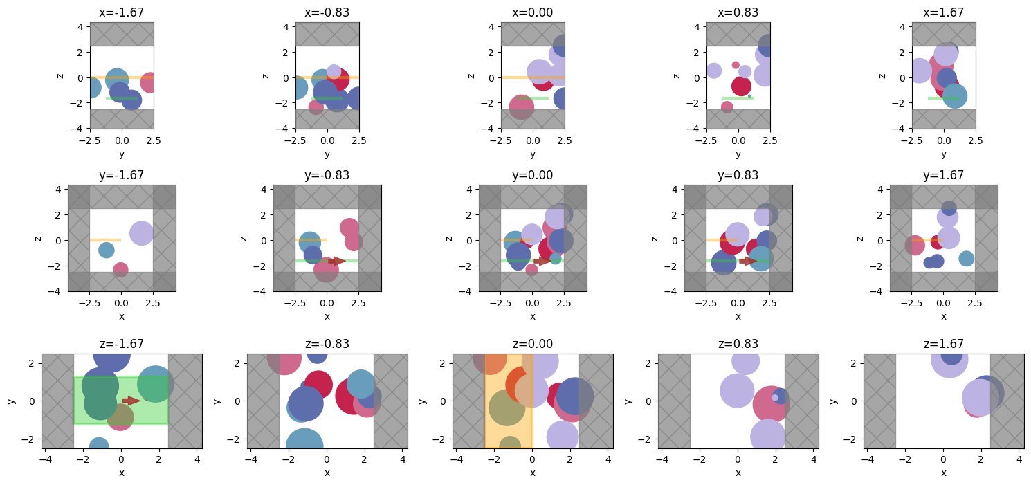
We can even get fancy and plot the cross sections at different positions along the 3 axes.
npos = 5
positions = np.linspace(-L / 3, L / 3, npos)
f, axes = plt.subplots(3, npos, tight_layout=True, figsize=(npos * 3, 7))
for axes_range, axis in zip(axes, "xyz"):
    for ax, pos in zip(axes_range, positions):
        ax = sim.plot(**{axis: pos}, ax=ax)
        ax.set_title(f"{axis}={pos:.2f}")
plt.show()
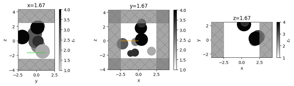
Plotting Permittivity
With Simulation.plot_eps we can plot the continuously varying permittivity distribution on the plane.
f, axes = plt.subplots(1, 3, tight_layout=True, figsize=(10, 3))
for ax, axis in zip(axes, "xyz"):
    ax = sim.plot_eps(**{axis: pos}, ax=ax, alpha=0.98)
    ax.set_title(f"{axis}={pos:.2f}")
plt.show()
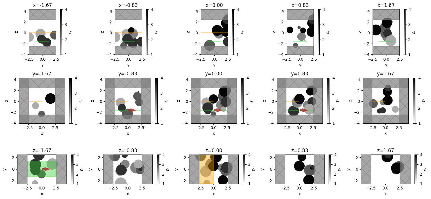
npos = 5
positions = np.linspace(-L / 3, L / 3, npos)
f, axes = plt.subplots(3, npos, tight_layout=True, figsize=(npos * 3, 7))
for axes_range, axis in zip(axes, "xyz"):
    for ax, pos in zip(axes_range, positions):
        ax = sim.plot_eps(**{axis: pos}, ax=ax, alpha=0.98)
        ax.set_title(f"{axis}={pos:.2f}")
plt.show()
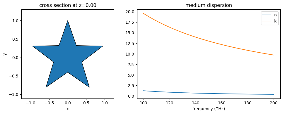
# import silver from material library
from tidy3d import material_library

Ag = material_library["Ag"]["Rakic1998BB"]

# make a star-shaped PolySlab
import numpy as np

r_in = 0.4
r_out = 1.0
inner_vertices = [
    (
        r_in * np.cos(2 * np.pi * i / 5 + np.pi / 2 - np.pi / 5),
        r_in * np.sin(2 * np.pi * i / 5 + np.pi / 2 - np.pi / 5),
    )
    for i in range(5)
]
outer_vertices = [
    (
        r_out * np.cos(2 * np.pi * i / 5 + np.pi / 2),
        r_out * np.sin(2 * np.pi * i / 5 + np.pi / 2),
    )
    for i in range(5)
]
star_vertices = []
for i in range(5):
    star_vertices.append(inner_vertices[i])
    star_vertices.append(outer_vertices[i])
poly_star = td.PolySlab(vertices=star_vertices, slab_bounds=(-1, 1), axis=2)

# make a star structure with silver as medium
silver_star = td.Structure(geometry=poly_star, medium=Ag)

# plot the structrue alongside the medium properties
freqs = np.linspace(1e14, 2e14, 101)
position = 0.0
axis = 2

f, (ax1, ax2) = plt.subplots(1, 2, tight_layout=True, figsize=(10, 4))
ax1 = silver_star.geometry.plot(z=0, edgecolor="black", ax=ax1)
ax2 = silver_star.medium.plot(freqs=freqs, ax=ax2)
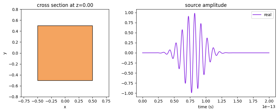
Source + Source Time
Similarly, the Source.source_time amplitude over time can be plotted with its .plot() method.
cube_source = td.UniformCurrentSource(
    center=(0, 0, 0),
    size=(1, 1, 1),
    polarization="Ex",
    source_time=td.GaussianPulse(
        freq0=1e14,
        fwidth=1e13,
    ),
)

times = np.linspace(0, 0.2e-12, 1001)
position = 0.0
axis = 2

f, (ax1, ax2) = plt.subplots(1, 2, tight_layout=True, figsize=(10, 4))
ax1 = cube_source.geometry.plot(z=0, facecolor="sandybrown", edgecolor="black", ax=ax1)
ax2 = cube_source.source_time.plot(times=times, ax=ax2)
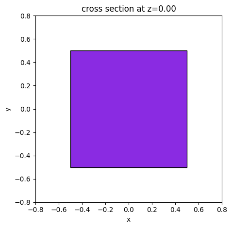
Monitor
freq_mon = td.FieldMonitor(
    center=(0, 0, 0),
    size=(1, 1, 1),
    freqs=list(np.linspace(1e14, 2e14, 11)),
    name="test",
)

position = 0.0
axis = 2

ax = freq_mon.geometry.plot(z=0, facecolor="blueviolet", edgecolor="black")

time_mon = td.FieldTimeMonitor(
    center=(0, 0, 0),
    size=(1, 1, 1),
    interval=10,
    name="test",
)

position = 0.0
axis = 2

ax = time_mon.geometry.plot(z=0, facecolor="blueviolet", edgecolor="black")
3D Plotting
Tidy3D now supports interactive 3D plotting of simulations through jupyter notebooks.
To render, call simulation.plot_3d()
sim.plot_3d()